Colour Exploration for Digital Work: Practical Tests and Light Studies
Practical colour tests and light studies tailored to digital illustration, with checklists for palette selection and small experiments to clarify mood and contrast.
Start with a question
Colour work is easier when you start with a specific question: do I want a low-contrast dusk mood, a high-key daylight study, or a warm interior light? Framing the intent narrows your choices and makes tests more useful.
Three compact experiments
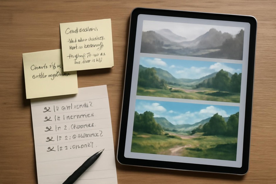
- Value study — Work in grayscale only to set clear light and dark relationships before introducing colour.
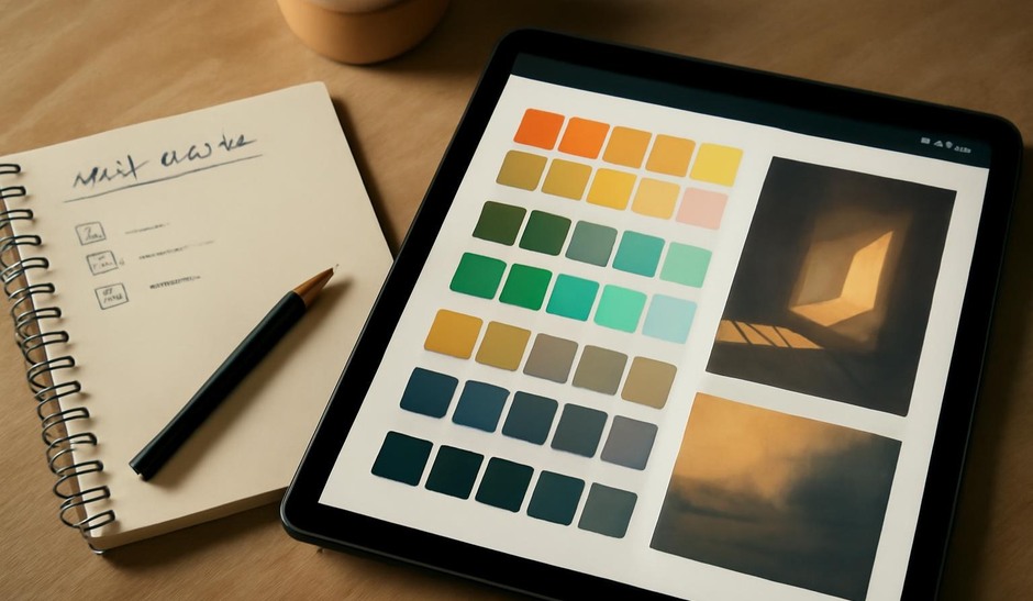
- Limited palette — Choose three main colours: a mid, a shadow, and a highlight. Paint shapes broadly to see how they interact.
- Light study — Paint the same scene with two different light directions (e.g., left-side warm key vs overhead cool key) to compare mood and clarity.
Checklist for a 60-minute colour session
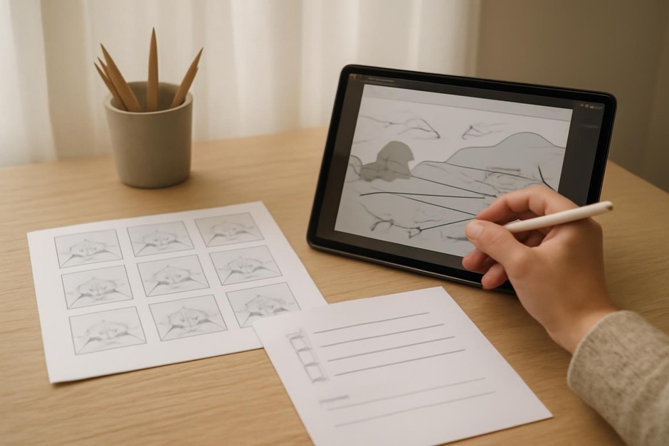
- Minutes 0–10: Decide the question and make a tiny value thumbnail.
- Minutes 10–30: Expand to a rough value sketch at working size.
- Minutes 30–50: Apply the limited palette and block colours without details.
- Minutes 50–60: Tweak contrast and add one small coloured focal accent.
Practical tips
- Use clipping masks or groups to protect your value structure when applying colour.
- Keep saturation restrained in large areas; reserve bright saturation for small focal points.
- Test your palette on a neutral mid-grey background to judge contrast reliably.
Reflection prompts
- Did the value study solve the main clarity problem before colour was added?
- Which light direction made the subject read best and why?
- Was any colour choice distracting rather than supporting the focal point?
Colour exploration is most efficient when it is limited and question-driven. Short experiments help you learn how palettes behave in practice so you can make deliberate colour choices for larger pieces.